FlightShift

Problem
Flightshift was born as both a personal project, and a class project. We had been instructed to design the user interface of any kind of application we wanted, be it mobile or web. My family and I had been planning a trip, and the search for flights was not going as we hoped for. Loads of information that we didn't need, cluttered results... So I took it upon myself to design a simple but effective flight search application that gets the job done.
Wireframe
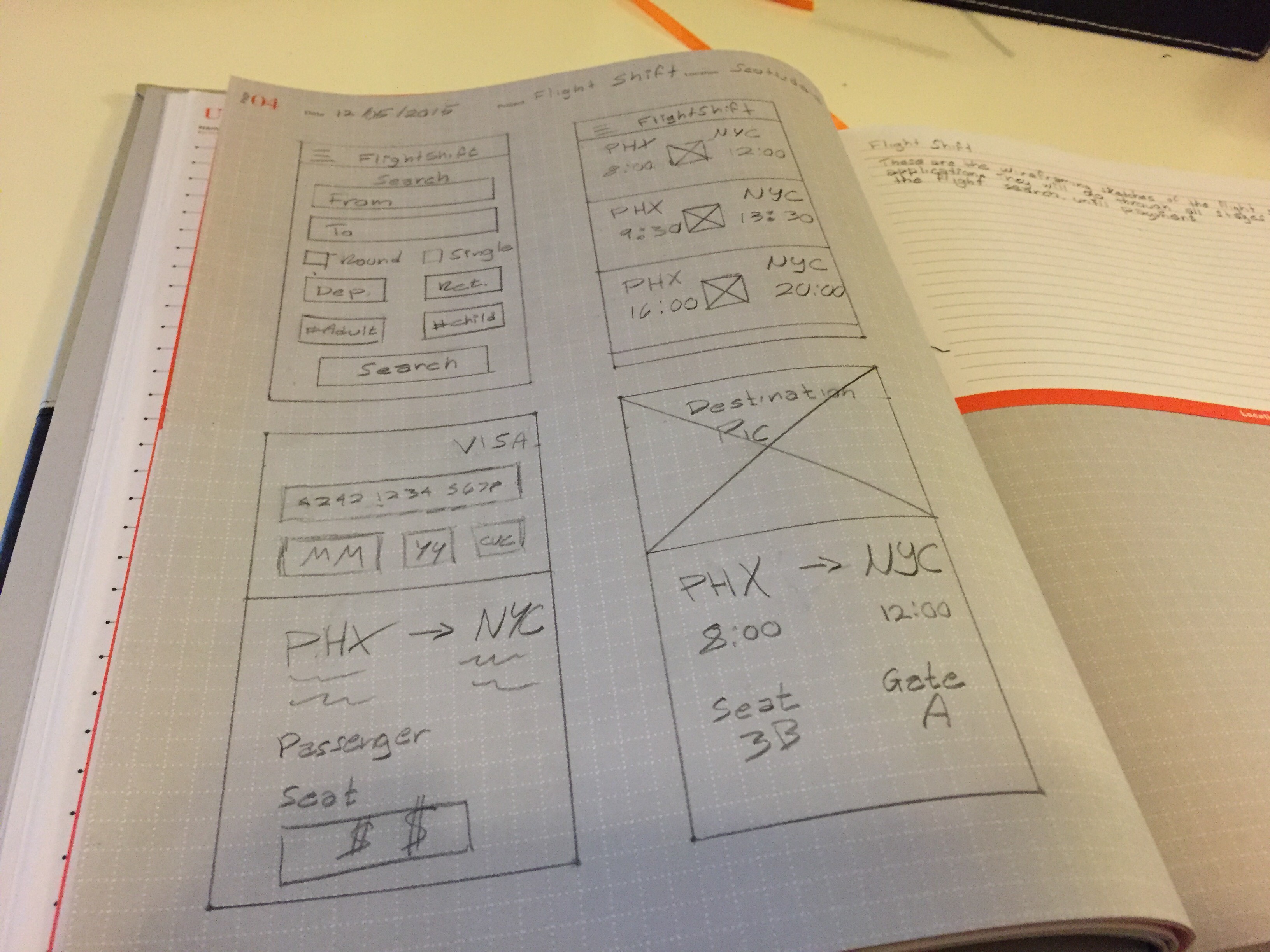
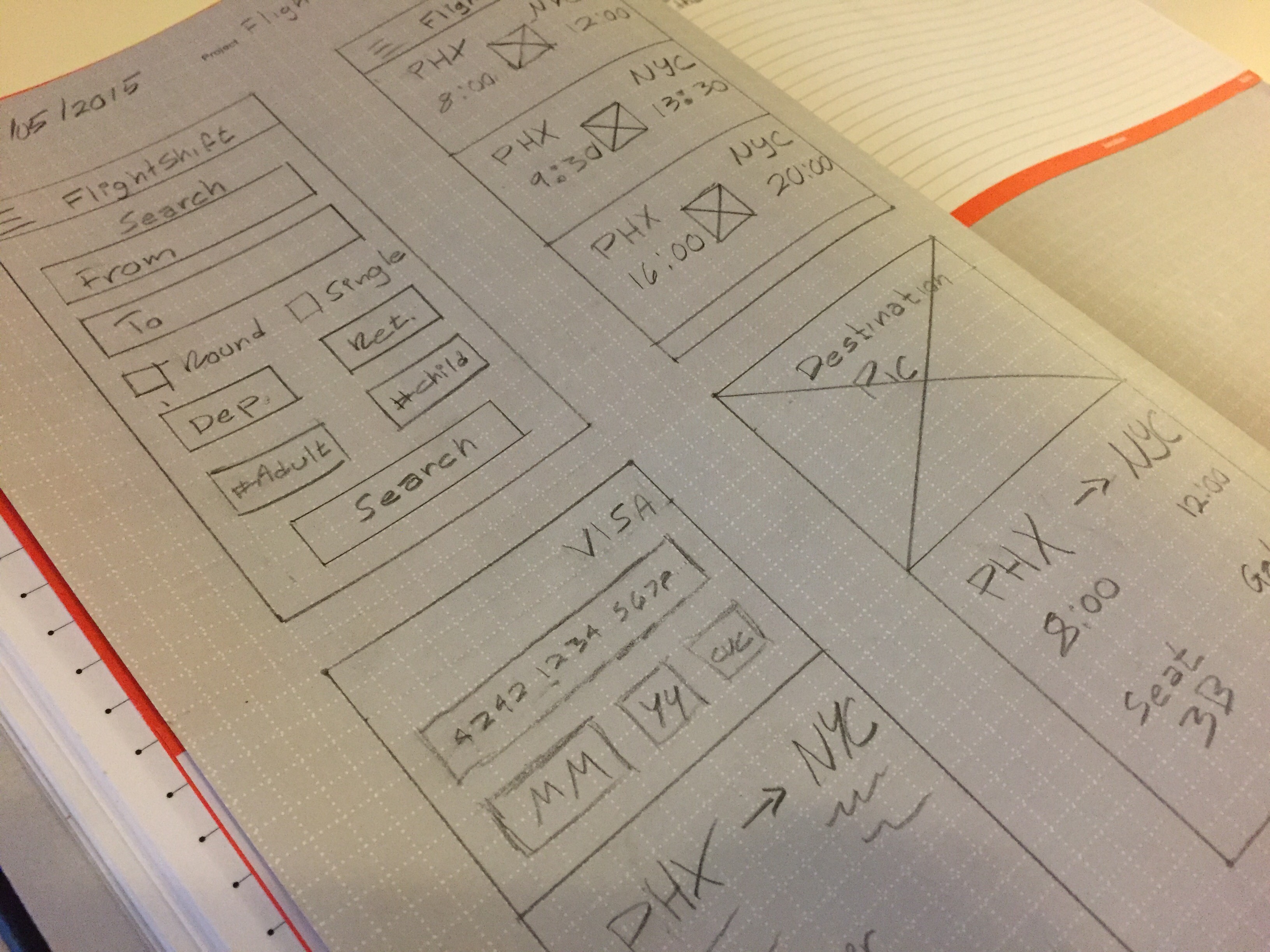
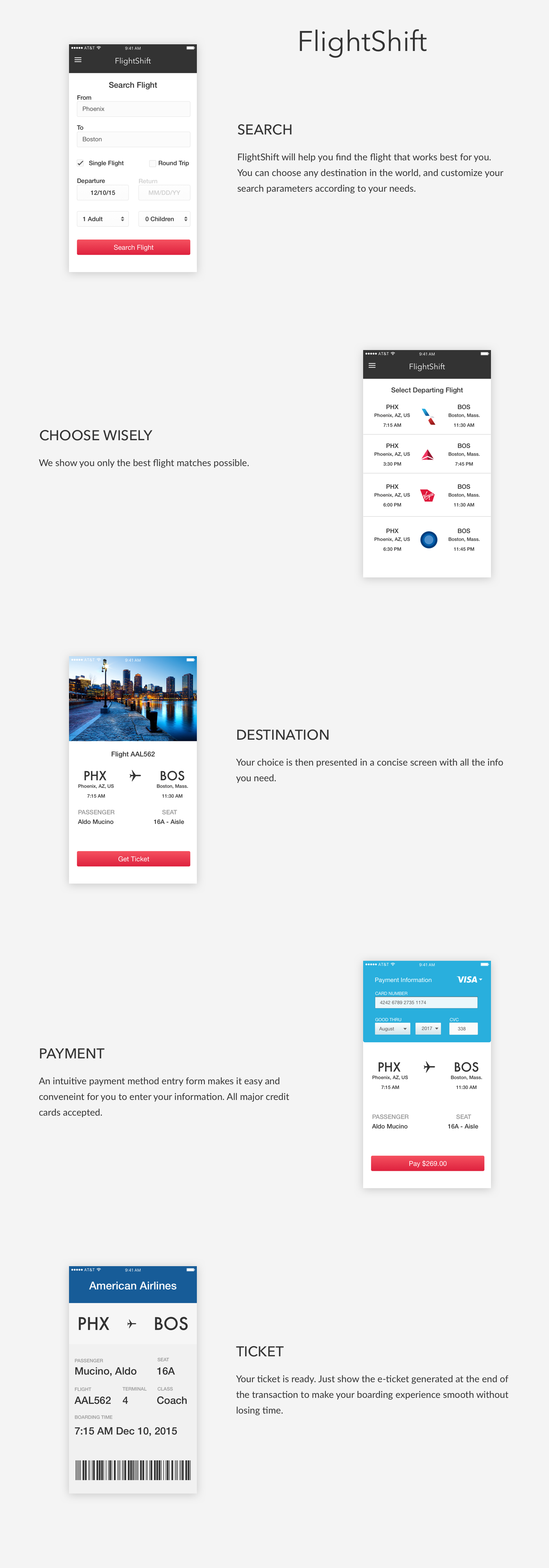
The application needed to be as straightforward as possible. It needed to ask for only the essential information when beginning your search query. The results page needed to be concise, display departure and arrival locations and times; the airline logo is also displayed.
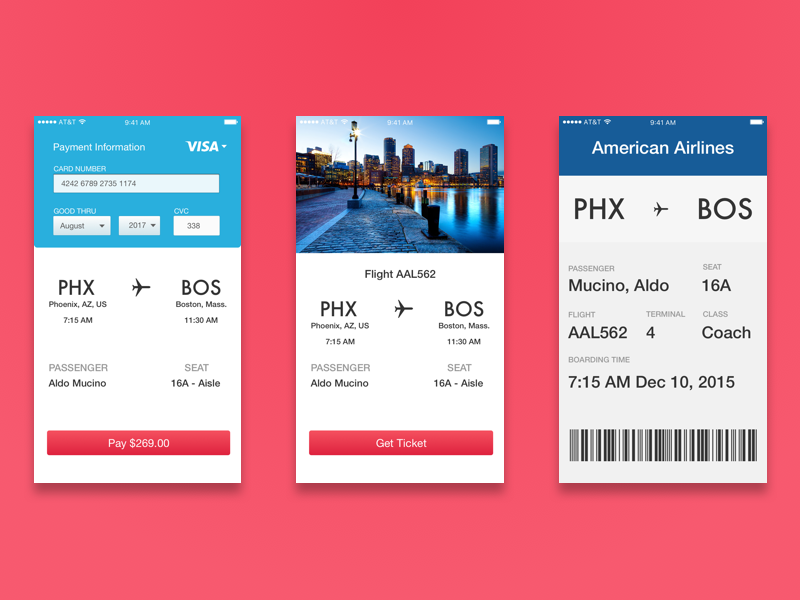
Once the flight or flights (if round trip was selected as part of the search query) are chosen, they are displayed in a screen where you can see the details of the selected flight. It shows a preview picture of the destination, arrival times, airports, and seat.
When ready to pay, the user can enter their payment information in a UI component that resembles a credit card, making it easier for the user to enter information in something that is already familiar. Once purchased, ther user is presented with an electronic ticket for their flight, including all relevant information, and a barcode that they can scan when boarding for their flight.


Result
After many hours of ideation and design, the final result came to be. Using Sketch, the wireframes and design concepts came into existence. A readable and already know font, Helvetica, was chosen, as well as colors that are sleek, but playful and minimal, to give it a modern and flat look.
